In October of 2014, I came across this pattern, called Astrodelic. It is a free download from Art Gallery Fabrics. At the time, it seemed way more difficult than my skills could handle, so I tucked it away in a folder.
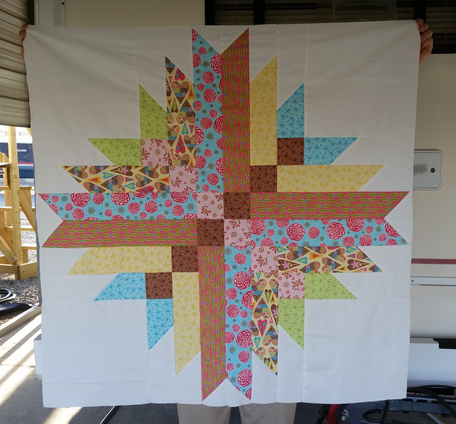
I've looked at the pattern several times in the last two and a half years, yet it always intimidated me. I recently bought a fat quarter bundle of Multiple Blessings by Caroline Simas, and the colors are similar to the ones in the pattern example, so I read it over again. Hmm, this doesn't seem all that complicated. It's really just four big blocks, and there are only two color combos. The piecing went quickly and I finished the top in about five hours!
However, I'm not thrilled with the result. The fabrics are very pretty and the colors are sweet for a girly baby quilt, but I didn't pay enough attention to value. Several very similar fabrics are right next to each other, and the pale yellow almost disappears against the Kona snow background. The small brown diagonal squares work well, but the pink ones mush into everything else. I also put all the solid reading fabrics in one set of blocks, and all the more patterned ones in the other.

I decided to try again with a much bolder and higher contrast palette, and this is the result. You don't get much more contrast than between black and yellow! I wanted a hot, bright star, so I kept everything in the yellow, orange and hot pink range with some older Kaffe Fasset fabrics and a couple of blenders. The patterns in yellow alternate with the solids/blenders in orange and pink. I used black for the diagonal small squares, and added an outer border so the bright points really pop out of the black.
An unintended consequence of using the small black diagonals is that I ended up with a larger black central square instead of a crossing four patch. Oh well, I think it still looks pretty neat, and I'm happy with this one. All that negative space will be great for some FMQ practice, maybe even in some contrasting gold or pink thread. We'll see how brave I am at the quilting stage.
Astrodelic was a well-written and straight forward pattern, in spite of my newbie quilter jitters. The second top took me less than four hours. I'll probably make this pattern again and do some more color and value playing. How about a rainbow next time?
This is a winner of a top!! I love the bold version.
ReplyDeleteOh yes please...that second one is stunning!
ReplyDeleteI like both quilts! Yes the first one has some issues, but I still think it's pretty!
ReplyDeleteI just caught up on your last three posts, and wow have you ever got a lot done since moving into the RV. They are all wonderful, and I love reading about how you come up with ideas for using the fabrics. It looks like you had no trouble setting up studio space in the RV!
ReplyDeleteThat second version is really eye-catching!
ReplyDeleteVery nice. I really like the black version.
ReplyDeleteI thought your first version was lovely and you were too critical of yourself - but seeing the next version I see what you mean... the colours and design really show up well...
ReplyDeleteHugz
They are both pretty neat! Well done! XO
ReplyDeleteJust catching up with all you have been doing. You have been busy. Both of these are nice Quilts. The second version just blew me away. I always think black is the perfect natural for bright colors. Job well done.
ReplyDeleteI've been catching up with ya today. You've been busy since your move to the RV I agree...both of these are very nice.
ReplyDeleteI think your being pretty hard on yourself. The blog coloured one is lovely, and I love brights and high contrast, but if I had to choose it would be the first one, it's the variety of colours, and from the pic the yellow is perfect.
ReplyDeleteWow, I like them both ways! It is a fabulous pattern and you chose great fabrics for both quilts.
ReplyDeleteThe first one was cute but hot damn that second one is gorgeous!!!
ReplyDeleteI struggle with color value too on certain quilt. but the first one really does fit the baby quilt category - it is cute. The second is very bold - I like both!
ReplyDeleteLouise, love this! I think both colorways are fabulous!
ReplyDeleteVery pretty! I really like your second one - brights on black are one of my favorite palettes. Looks great!
ReplyDelete